With the Women in Agency Festival, La Femme Theatre Productions founder Jean Lichty ’81 gives recent Barnard grads a powerful platform for original work

Artist, educator, activist, feminist: For over five decades, Sheila Levrant de Bretteville ’62 has profoundly influenced the world of graphic design through both her practice and teaching. The Brooklyn native’s groundbreaking work has reshaped public spaces by integrating a diverse set of voices that are all too often left out of the cultural conversation.
Levrant de Bretteville graduated from Barnard in 1962 and went on to receive her M.F.A. from Yale University in 1964. In 1971, she created the first Women’s Design program at the California Institute of the Arts. Two years later, she co-founded the Women’s Building — a hub for women designers and artists to gather, work, and learn.
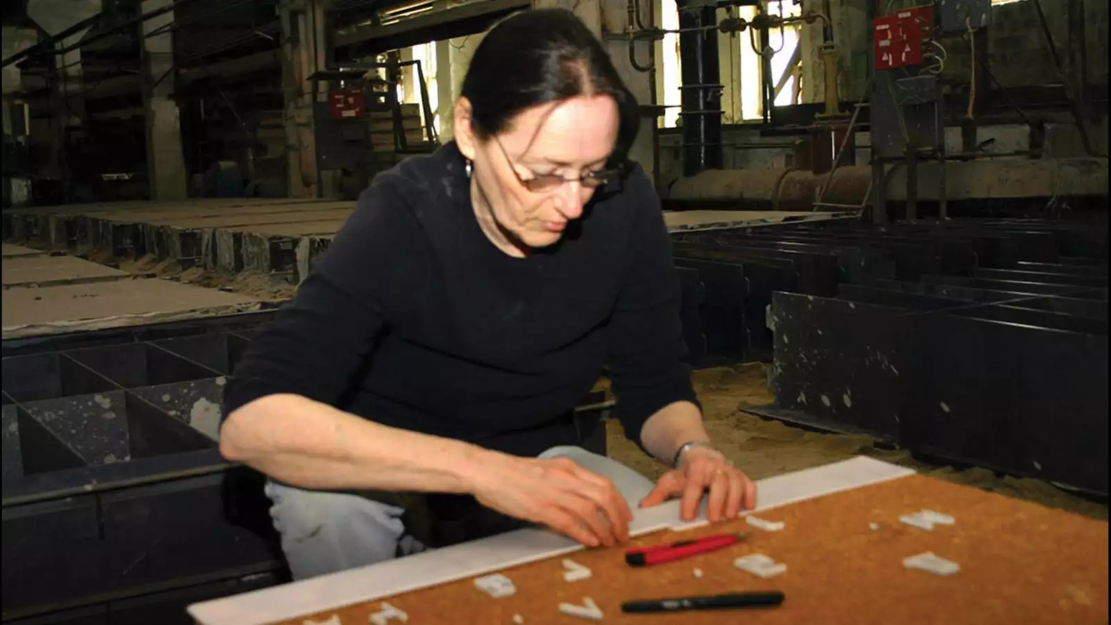
Her design work includes The Motown Album, a 1981 redesign of the Los Angeles Times, and special issues of the Aspen Times, Everywoman, American Cinematographer, and Arts in Society. Her posters and fine press editions are in the special collections of the Museum of Modern Art, the Victoria and Albert Museum in London, and the Centre Pompidou in Paris. Her site-specific public artwork includes Omoide no Shotokyo in Los Angeles; Search: Literature in Flushing, New York; Path of Stars and Hillhouse in New Haven, Connecticut; and Step(pe) in Yekaterinburg, Russia.
Levrant de Bretteville found her way back to Yale in 1990 when she took the reins as the director of graduate studies in graphic design at the Yale School of Art, a position she still holds, and became its first tenured female professor. Throughout it all, she has helped mentor other designers, encouraging them to thread innovation and self-exploration throughout their work.
The American Institute of Graphic Arts designated her a “Design Legend” in 2006.
From almost everyone, everything, and every place. And I follow the advice I give my students, to “pay attention…. It connects you with others,” a quote from Susan Sontag. I have tried to support and make public the voiced needs and lived experience of people in the neighborhoods wherever my work has been installed, and even before when I only worked in print with a participatory newspaper for the 1972 International Design Conference in Aspen. I totally enjoy, as Sarah Oppenheimer wrote, “scrambling the hierarchy” of the “powerful and powerless, by creating a radical sense of place and subjectivity.”
That is a harder question than it appears. I spent three hours a day on the subway to Barnard and back to Brighton Beach for the first three years, which competed with my classes in terms of impressions, as did my father dying during my first semester. Strangely, I remember most a class by Meyer Schapiro at Columbia vividly, as it was about the view from inside of moving trains, as well as a young teacher of literature — who crossed her feet under the table — and read to everyone in the class my written response comparing Coriolanus to Heathcliff, as evidently I was the only person to write and not favor Heathcliff! And I remember a young male faculty member who said, “You should eat more spaghetti” to me in front of a group of my peers in a hallway while referring to how skinny I was then.
I tend to focus on the people who are left out in each group, as that both disrupts and engages the public sphere — and as a feminist, I am inclusive — as well as displacing hegemony and engaging social experience.
Inclusive, reorienting, questioning.
Oh dear, I have two … hmmm. My first public permanent work, Biddy Mason: Time and Place, and the one at 207th Street, the installation At the Start ... At Long Last in New York City. Both my friend Betye Saar [an artist renowned for her assemblages], who lives across the street from our home in L.A., and I did projects about [19th-century landowner and philanthropist] Biddy Mason at the same time for a new building in downtown L.A. I created a long, cast concrete wall in which I had placed objects that signified important moments in her life. Although born into slavery in Georgia, Mason was a midwife who obtained her freedom. Everyone, including blind people, can touch and read the images and texts on the 10-foot-long wall. And At the Start... At Long Last uses terrazzo in the entrance floor and mirror and silver tessera on the station’s walls [in the mezzanine, near the south entrance] to say “At the start...” and “At long last…” and are followed by 207 quotes from people of all origins living in the Inwood neighborhood.
Mostly jazz music or silence, which is rare for a person who grew up in a household full of recent immigrants.
Pink cotton candy.
Not bothering to worry about anything and anyone.
Inside people’s homes, and also in museums and galleries.
Being 80 and as healthy as I ever have been.