Featured Card Title #1
This card has no image or link.
We recommend you NOT check the "Animated with borders" checkbox beneath the optional title at the top of this component. It makes the required link below show over the top of the middle card.
Mini site landing pages are used on Barnard's mini sites as home pages for departments or centers. See how to set up a mini site landing page on Barnard's Website Resources site.
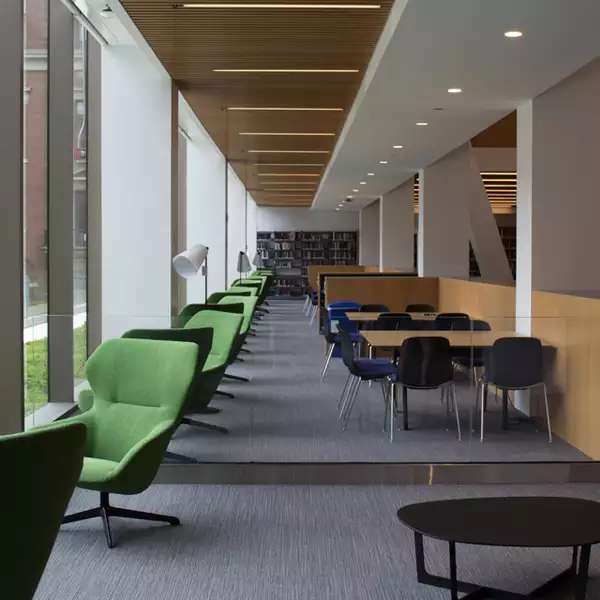
This page type has many visually engaging components. We've grouped similar components together so you can more easily compare them.
Several components use an image that fills the whole width of the browser window. They include the following:
Images for these components should be at least 1600 pixels wide. They are cropped automatically, so be sure to use the focus and preview functions when uploading a new image.
Required fields include the title, description, image, link, link text, and align.
Align "normal" places a white box over the left side of the image. "Reverse" puts it on the right side.
Images should be at least 1600 pixels wide.
Keep the text brief. It will be displayed over the image. The link must be internal, not to an external site.

Here's the description text, which is optional.
Note: The image is also optional, but the point of this component is to juxtapose an image on one side with text on the other.
Title, orientation, and color theme are required.
Short text description. This field is required, as is the associated image field.
If you use only 2 images, they'll display larger than 3 will.
Another short description. This component works well with 2 or 3 "bites" or text-image pairs.
Third section of text.
This card has no image or link.
We recommend you NOT check the "Animated with borders" checkbox beneath the optional title at the top of this component. It makes the required link below show over the top of the middle card.
Card with an image.
Card with an image and a link.
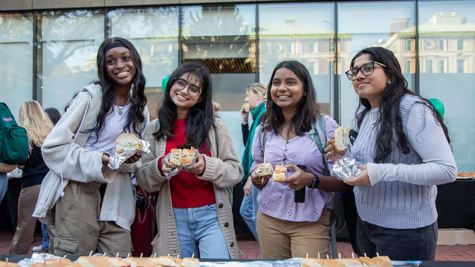
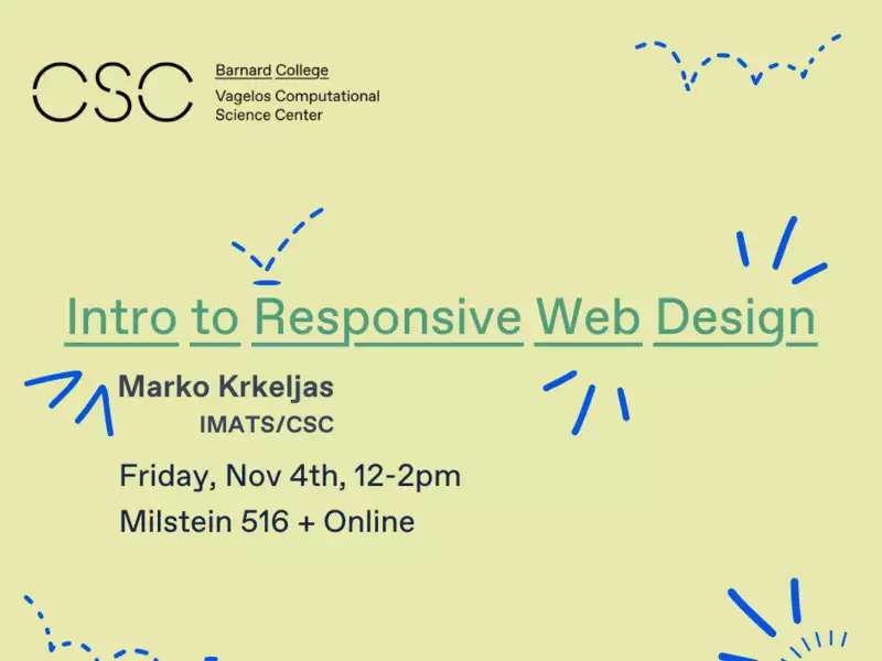
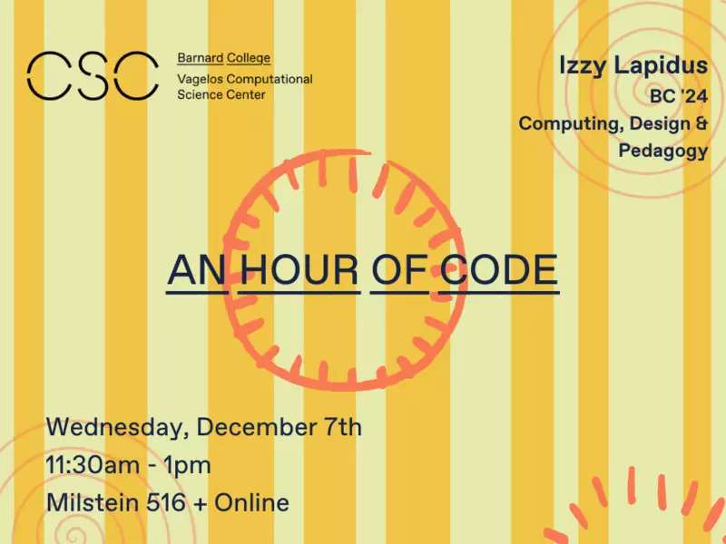
These components are great options for showcasing events in your department if you don't have enough to create an individual event page.
These components allow you to link to already created stories on Barnard's website.
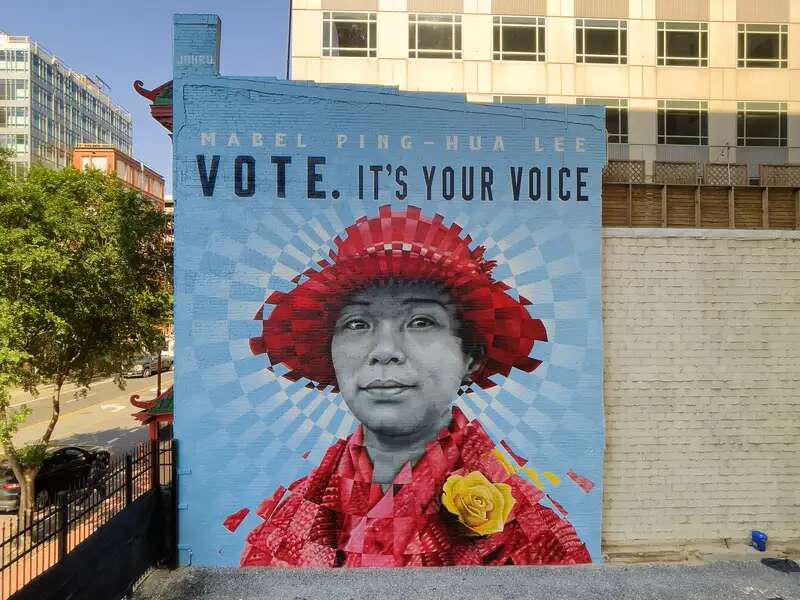
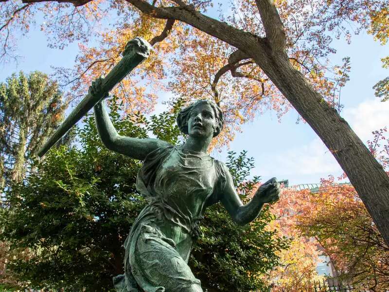
The Barnard graduate became the first Chinese woman in the U.S. to earn a doctorate.
Barnard College has been recognized as a top producing institution for the Benjamin Gilman International Scholarship, which supports Pell Grant recipients studying abroad.
Students from Barnard College earned prestigious Fulbright grants to pursue research projects and teach English in countries around the world.

On November 11, the College recognizes the exemplary sacrifice and leadership skills of its ROTC students and alumnae in the military.
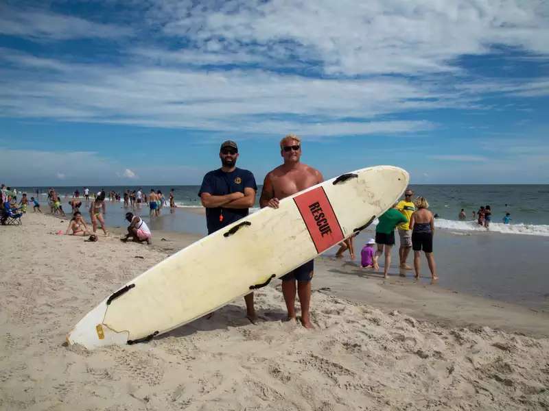
From Barnard to the beach, Keith Gabora and Cory Lapp respond to campus needs by tending the grounds and to beach dangers by saving those at sea.
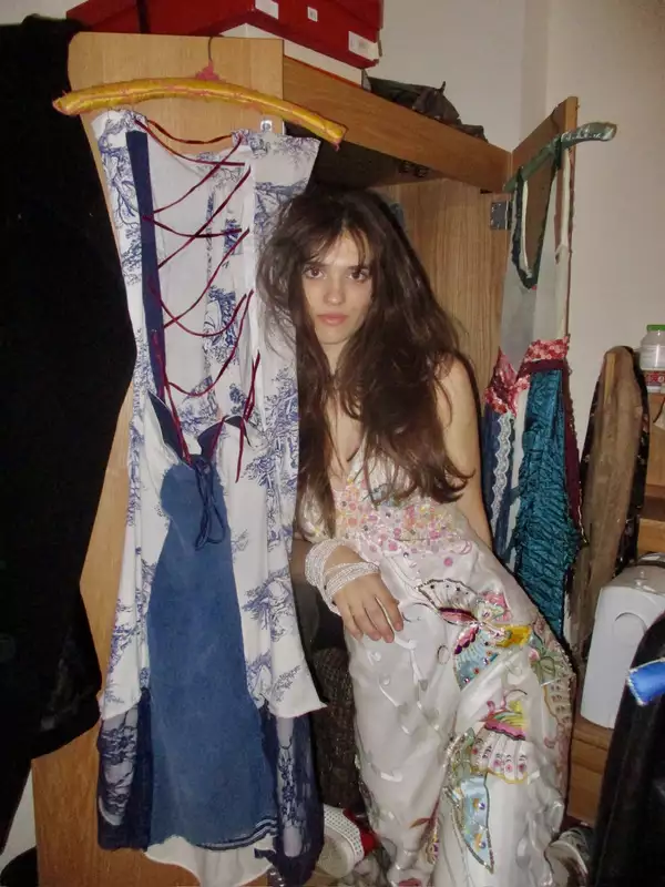
The first-year shares how her designs went from being featured in on-campus fashion shows to on stage at a United Nations Climate Change Conference.
Associate professor of philosophy Karen Lewis shares her mission to connect humanity across space and time.
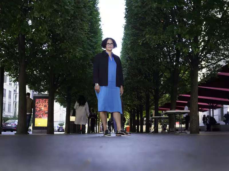
Tapped by the Costume Institute to curate its annual blockbuster exhibition, professor Monica L. Miller is using her research on Black style to educate fashion enthusiasts on Black dandies.
The title is required but this description is optional. Multiple links can be added.
This component requires a title, description, background image, link, and link text.
The background is beige and covers the full width, but the image does not.
Number of visual-heavy components available, including this one.
These components require special code to be inserted, so they are not shown as examples:
Columns is another component not demonstrated here. It's better used on pages with fewer visually rich options. See the Basic Page Example.