Basic Page Example
About this example
Basic pages are used throughout Barnard’s main website and mini sites. See how to set up a basic page on Barnard’s Website Resources site.
This page type has no hero image component at the top and does not support large, visually engaging components. It’s a no-nonsense kind of page.
Components available
This text is displayed in a “Body WYSIWYG” component.
Other components available for use on a basic page include the following and are shown below:
- Accordions
- Columns
- News content listings
- Event content listings
Accordions Component
Here’s the text that remains hidden inside of the accordion until a user “opens” it.
Both the “Question” and “Answer” fields are required.
The “Answer” field is similar to a body WYSIWYG component with the ability to style and link text.
Accordions can be a way to present a lot of text. Images don’t work in them, however.
Columns Component

This example of two columns uses the 30%-70% width option, which can be useful for headshots and some text.
Other width options include 50% (for 2 columns), 33% (for 3 columns), 25% (for 4 columns), and 70%-30% (for 2 columns).

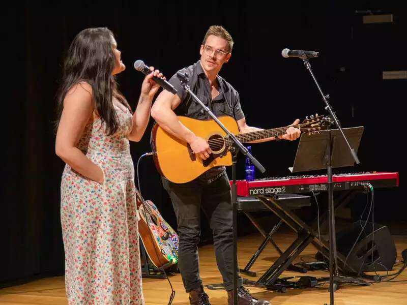
Luminaries gathered at the College for a ribbon-cutting ceremony and performances to pay tribute to the LeFrak family’s commitment to artistic excellence and community wellness.

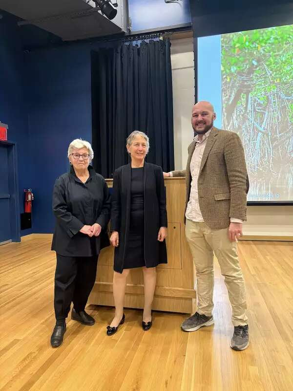
Barnard welcomed the environmental activist author for a talk on the most invaluable resource of all — nature.

About the events shown, or not, above
This component requires you to choose keywords from the “Taxonomy” to curate the events that are shown. We chose New York City, Alumnae, and Women.
If no events are shown above, that means no upcoming events have been tagged with these terms from Barnard’s taxonomy.
