With the Women in Agency Festival, La Femme Theatre Productions founder Jean Lichty ’81 gives recent Barnard grads a powerful platform for original work

In the wake of the 2016 presidential election, graphic designer Alicia Yin Cheng ’92 found herself trying to make sense of the outcome. How, she wondered, did we get here? How did our nation previously survive politically challenging times?
“It made me want to go back to Barnard again to take American history courses and really dig deeper into what those lessons [from the past] are teaching us now,” she says.
Looking for answers, she revisited a project she had started years before. In 2008, Cheng had stumbled on Jill Lepore’s New Yorker article “Rock, Paper, Scissors: How We Used to Vote.” One line, in particular, about brightly colored ballots piqued her curiosity, inspiring her to do some initial research on ballot design. But it wasn’t until the 2016 election that Cheng — who, at the time, was co-running MGMT. design, a collaborative, women-owned studio based in Brooklyn that she’d co-founded — decided to dive back into the research and think about turning her idea into a work of art.
The project, Cheng says, was “an investigatory process.” She spoke with printers who used the same traditional techniques as the letterpresses that printed ballots in the 19th and 20th centuries. She conducted archival research at libraries in New York City, Massachusetts, and California. The inherent transient nature of ballots made this undertaking all the more interesting to Cheng. “As I say in the book, the ballot is described as the most fugitive ephemera, so it’s not really supposed to survive, it is supposed to be destroyed.”
In the summer right before the 2020 election, Cheng’s book, This Is What Democracy Looked Like: A Visual History of the Printed Ballot, was published by Princeton Architectural Press. The timing of its release proved prescient, just as the American voting system once again came under intense public scrutiny.
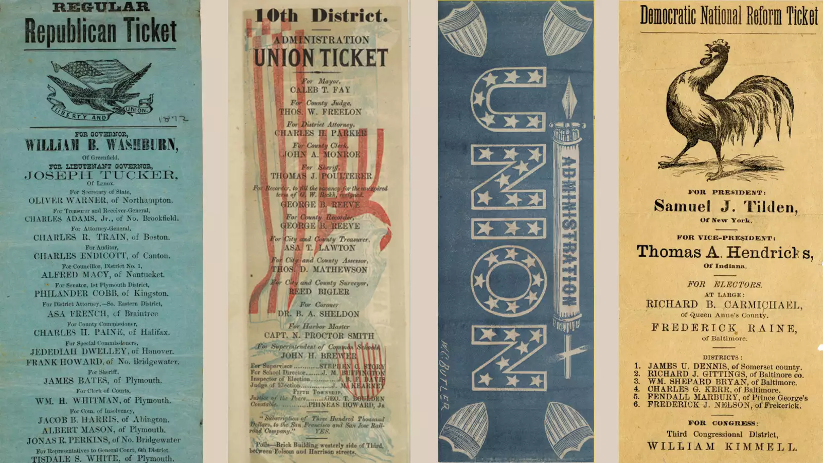
In the pages of Cheng’s visually rich compendium, she guides readers through two centuries of ballot design, providing historical context and sharing little-known details about the evolution of the American electoral process. Ballots range from fanciful curios to tools of propaganda. They reflect printing and production innovations as well as design trends of the day. We learn that our elections were fraught with trickery and fraud — not to mention blatant racism and exclusionary practices — but eventually, dysfunction led to progress, including the implementation of a standardized, state-administered ballot and private voting.
“It was the journey of learning about how our civic practices have evolved that has led me to the point where I just don’t take anything for granted,” says Cheng. “Voter suppression and disenfranchisement happened right from the very beginning of our history — and so it doesn’t make you accept it, but it makes you understand that this is sort of built into the foundation of what we call democracy.”
Cheng is currently the head of design at the Metropolitan Museum of Art, where she oversees a team of around 30 people who work on everything from exhibition design and printed materials to lighting and production. Her interest in the design of American ephemera — and what it means more broadly for American culture and democracy — has not waned. This summer, Cheng was appointed by the United States Postal Service to serve on the Citizens’ Stamp Advisory Committee. As one of 12 members, she lends her expertise to review submissions and make recommendations for future stamps.
“It’s just a fascinating exercise to sit with a table full of people discussing the merits of different proposals that range from famous artists from the ’20s to natural landscape to certain native flora and fauna and novelty culture. And you’re trying to weigh what is going to be popular for the buying public,” says Cheng. “That has been really fun for my brain to go really wide but so deep on so many different subject matters.”
FEATURED IMAGES AT TOP: Left: The Regular Republican Ticket, 1872, came in two colors: blue (featured) and yellow. Center and near right: Double-sided ballot of the 10th District Administration Union Ticket, Sacramento, California, 1851, includes the artist’s signature on the back and highlights how ballots often featured various printing styles of the period. Far right: Democratic National Reform Ticket, Maryland, 1876, features a “sassy rooster” as its emblem. (Left to right: Courtesy of American Antiquarian Society; The Huntington Library, San Marino, Calif.; Smithsonian Institution)