Chaptered Page Example (H1)
Chaptered Page Example (H1)

About Chaptered Pages (H2)
This type of page works in any site. It's designed for lengthy pages with lots of text that's well organized with clearly delineated sections--or chapters--of content. See Chaptered Page: Use Cases + Setting Up for details.
The chapter titles show up in the left navigation bar, which supports users in their search for information within the page.
Chapter titles and the left navigation bar (H3)
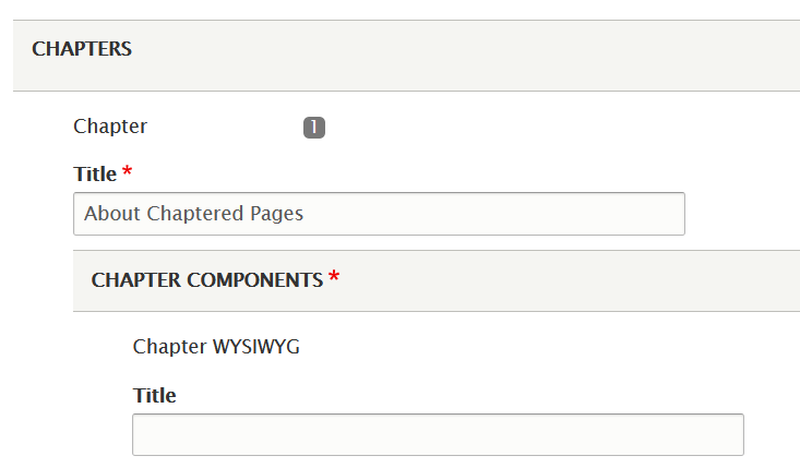
Each "chapter" of your page has a title field. The text in that field is automatically added to the left navigation bar under "On This Page."
The chapter title should be clear and descriptive. It's the headline for that section of content.

Use the chapter title as a heading inside the relevant chapter (H3)
To add the same text that's in the left navigation bar to the body of your page, you have a couple of options.
- Use the Title field available in both the Chapter WYSIWYG and Accordion components.
- One drawback is that the styling is inconsistent across components. You may not like how the "Title" text looks or the size.
- Add the heading text to the "Body" of a Chapter WYSIWYG component.
- Above, the heading "About Chaptered Pages" is in the body text of the chapter WYSIWYG and styled with "Heading 2." The heading "Use the chapter title as a heading inside the relevant chapter" is styled with "Heading 3." You can adjust the heading size by using the "Format" button in the WYSIWYG toolbar.
Ways to Display Content (H2)
A chaptered page has 3 types of "chapters" or sections:
- Chapters are the most versatile because they accommodate several different components including events listings. The first 2 sections of this sample page use the "chapter" type.
- Accordions use a simple "question" and "answer" format to display lots of information in a smaller space by keeping the "answer" hidden until the user asks to see it by clicking the +.
- Dates & Events are also available but can be wonky. We recommend using the events components available within a chapter instead.
Below are examples of components available in a chapter (H3)
- Featured Events
- Category Events
- Chapter Link List
- Columns
- Important Dates
Featured Event Example (H2)
A Note About Category Events (H3)
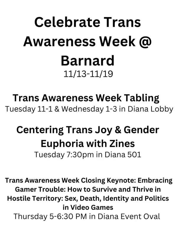
This event component does not have its own title field. This text is displayed in a Chapter WYSIWYG.
Chapter Link List Example (H2)
No fields are required in this component.
This page type works well when you have lots of text. It doesn't support components with full-screen images.
One additional component this page type offers compared to the Basic page type is that an academic department's course listings can be auto-populated using the Courseleaf component.
Columns Example (H2)

This Columns component uses 2 columns, 30%-70%. The headshot was embedded in the body of the left column, leaving the wider right column for more text.
This particular component can be useful for headshots and short bios of faculty or staff.
Note that the column header is centered and not left-aligned like the rest of the titles on the page.
Important Dates Example (H2)
Sample Required Title (p)
The Description field is not required.
The DATE field is not working correctly, so we suggest skipping that.
To add a Link, you'll search for a pre-existing page by its title.
An Accordion Example (H2)

Accordions are good for presenting lots of content, such as FAQs, in a small space.
The accordion component is also available on basic, mini site detail, and profile pages.
